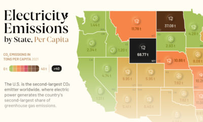

This graphic showcases electricity emissions by state, highlighting each state's largest source of power.
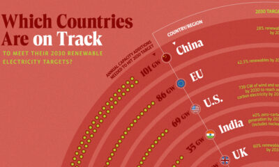

In this graphic, we visualize whether major electricity-consuming countries are on track to meet their 2030 renewable energy targets.
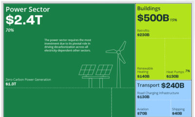

The clean energy transition will cost $110 trillion in global capital investments between 2021 and 2050. Here's that sum broken down by sector.
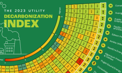

Here is a preview of our 2023 Utility Decarbonization Index, which tracks the decarbonization progress of the largest investor-owned utilities in America.
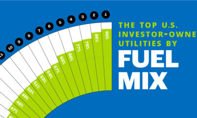

In this chart, we rank the top U.S. utilities by the share of low-carbon sources in their owned electricity generations.
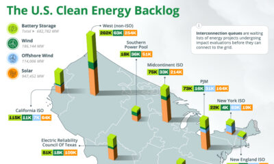

The U.S. has almost 2 million megawatts of clean energy capacity on hold in interconnection queues, seeking connection to the grid.
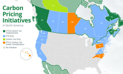

We map out all of the national and subnational carbon pricing initiatives in North America using data from the World Bank.
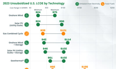

Can the transition from fossil fuels to clean, emission-free electricity sources be accomplished in a financially viable manner?
This infographic tracks the extent of electrification in the residential, commercial, industrial, and transportation sectors.
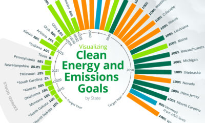

An overview of each U.S. state’s ultimate clean energy or GHG emission reduction goal, broken down by goal type and target year.