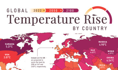

In this set of three maps, we show the global temperature rise on a national level for 2022, 2050, and 2100 based on an analysis by...
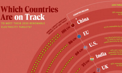

In this graphic, we visualize whether major electricity-consuming countries are on track to meet their 2030 renewable energy targets.
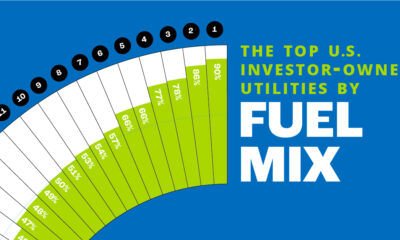

In this chart, we rank the top U.S. utilities by the share of low-carbon sources in their owned electricity generations.
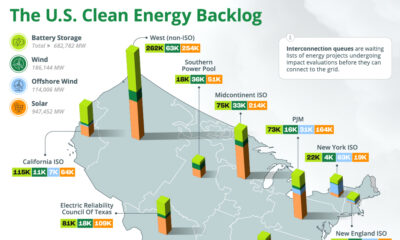

The U.S. has almost 2 million megawatts of clean energy capacity on hold in interconnection queues, seeking connection to the grid.
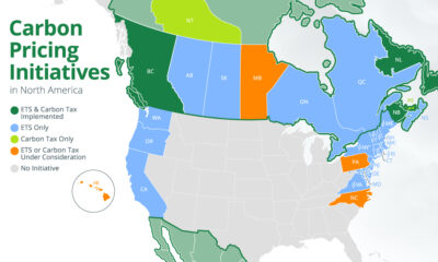

We map out all of the national and subnational carbon pricing initiatives in North America using data from the World Bank.
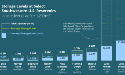

This infographic explores how droughts are affecting U.S. hydroelectric generation and the future of hydropower.
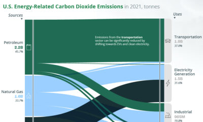

A look at the flow of energy-related CO2 emissions from the sources that generate energy to the sectors that use it.
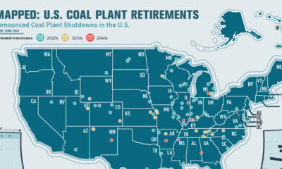

This infographic highlights announced coal plant closures in the U.S. and how much power will be affected.
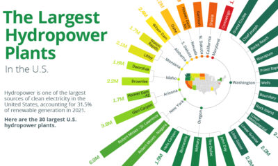

Hydropower accounts for one-third of U.S. renewable power generation. Here are the 30 largest U.S. hydropower plants.
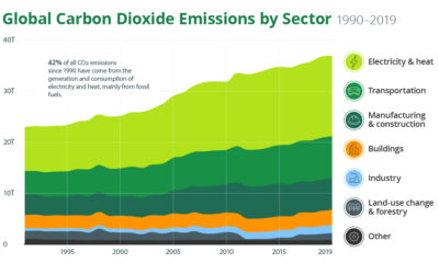

What is the current state of the climate change crisis, and how can we mitigate it? Find out in this infographic.