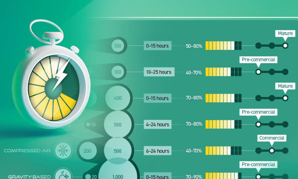
In this chart, we break down the parameters of LDES technologies that have commercial or pre-commercial readiness.


This graphic shows the projected evolution of global energy employment between 2022 and 2030 using data by the International Energy Agency.
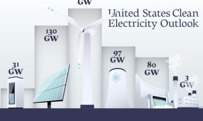

In this graphic, we explore the projected generation capacity of different clean electricity technologies in the U.S. for 2023 and 2024.
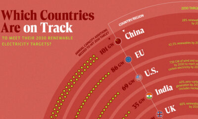

In this graphic, we visualize whether major electricity-consuming countries are on track to meet their 2030 renewable energy targets.
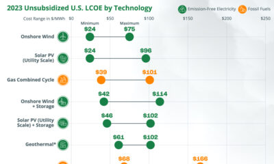

Can the transition from fossil fuels to clean, emission-free electricity sources be accomplished in a financially viable manner?
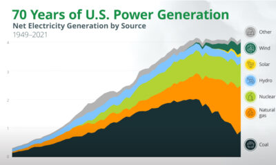

In this animated chart, we explore the past 70 years of U.S. electricity generation by source.
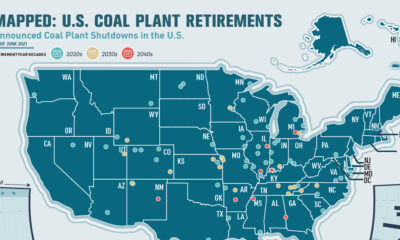

This infographic highlights announced coal plant closures in the U.S. and how much power will be affected.
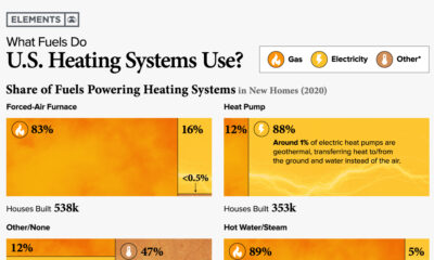

Charted: Home Heating Systems in the U.S. This was originally published on April 25, 2022, on Elements. Fossil fuel combustion for the heating of commercial and...
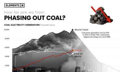

More carbon in the atmosphere is creating a hotter world—and gradually fuelling both climate change and instances of wildfires.
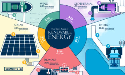

Renewable energy is the foundation of the ongoing energy transition. What are the key types of renewable energy, and how do they work?