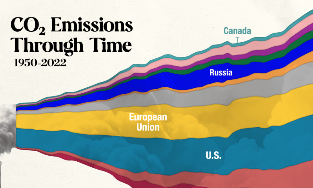
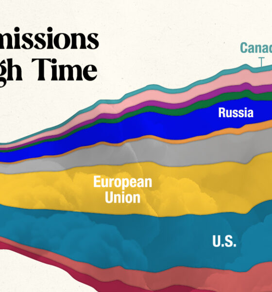
In this streamgraph, we break down global CO2 emissions between 1950 and 2022 using data from Berkeley Earth and Global...
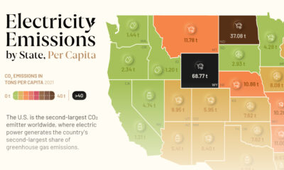

This graphic showcases electricity emissions by state, highlighting each state's largest source of power.
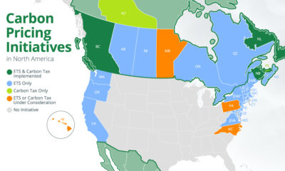

We map out all of the national and subnational carbon pricing initiatives in North America using data from the World Bank.
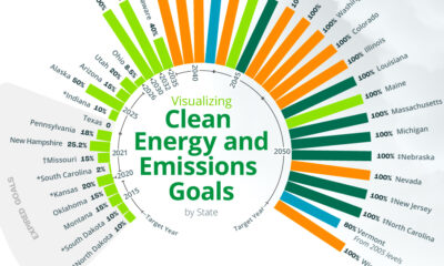

An overview of each U.S. state’s ultimate clean energy or GHG emission reduction goal, broken down by goal type and target year.
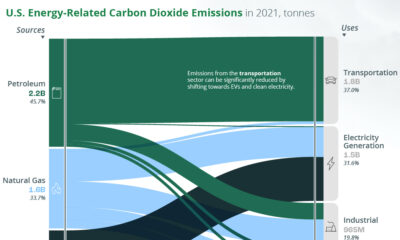

A look at the flow of energy-related CO2 emissions from the sources that generate energy to the sectors that use it.
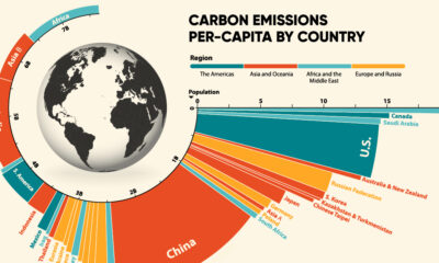

Highest Per Capita CO2 Emissions This was originally published on December 1, 2021, on Visual Capitalist. Developing countries like China, India, and Russia are some of...

More carbon in the atmosphere is creating a hotter world—and gradually fuelling both climate change and instances of wildfires.