

What advantages do small modular reactors offer compared to their traditional counterparts?
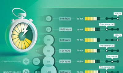

In this chart, we break down the parameters of LDES technologies that have commercial or pre-commercial readiness.
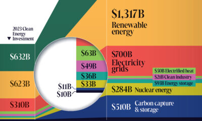

In this graphic, we explore the $3 trillion clean energy investment gap visualized by sector, according to BloombergNEF data.

Streamlining processes, investing in infrastructure, and promoting local manufacturing can pave the way for wind and solar adoption.


This graphic shows the projected evolution of global energy employment between 2022 and 2030 using data by the International Energy Agency.
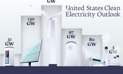

In this graphic, we explore the projected generation capacity of different clean electricity technologies in the U.S. for 2023 and 2024.
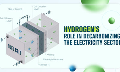

In this infographic, we discuss three ways hydrogen can support the decarbonization of the global electricity sector.
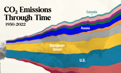

In this streamgraph, we break down global CO2 emissions between 1950 and 2022 using data from Berkeley Earth and Global Carbon Project.
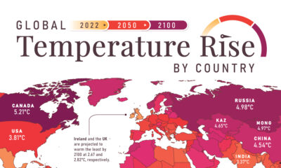

In this set of three maps, we show the global temperature rise on a national level for 2022, 2050, and 2100 based on an analysis by...
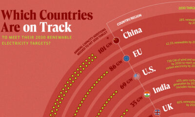

In this graphic, we visualize whether major electricity-consuming countries are on track to meet their 2030 renewable energy targets.